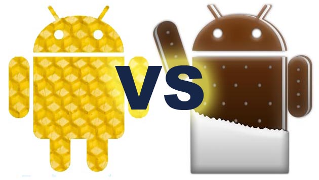
Everything on Honeycomb feels very slick, well planned out and well put together. The layout is clean and crisp, and animations and screen transitions play out smoothly, letting you effortlessly navigate from one section to another.
The settings menus also make great use of the expanded tablet screen real-estate, with a dual split-screen setup that can be independently swiped through.
Compared with previous builds, the notification panel is a little different. Rather than a swipe down bar from the top you now have a pop out menu at the bottom right, activated with a tap or swipe. This has been placed with thumb control in mind and works very well.
At first, Ice Cream Sandwich (ICS) doesn’t seem very different, apart from some visual changes such as fonts, icons and so on, but these are just aesthetic tweaks. The layout is still much the same.
The lock screen has been changed for the better and now includes not only the padlock icon but a camera icon, which allows you to go straight into the camera href=”http://www.apple.com/itunes” rel=”homepage” target=”_blank” title=”App Store (iOS)”>app.
Speaking of the camera app, it now uses much more screen space for the viewfinder, so you can see exactly what you’re trying to snap. As well as this the controls have been changed with a radial zoom slider around the capture button.
Another welcome upgrade is the multi-tasking menu. It still features the same scrolling thumbnail previews of each running app but you can dismiss them individually by swiping an app window left or right, which is much more convenient than going into the settings menu and finding the running apps section.
Folders are supported in Ice Cream Sandwich. Previously this was something only offered by custom interface overlays installed by manufacturers, but now it’s integrated into href=”http://code.google.com/android/” rel=”homepage” target=”_blank” title=”Android”>Android
and is a very useful way of grouping apps together in handy boxes to keep your homescreens as tidy and organised as possible.Settings menus on Ice Cream Sandwich are even better than they were on Honeycomb, thanks to a reorganised and much more logical layout. There’s still the split-screen functionality but it’s a lot easier to find what you’re looking for, making it more user-friendly.
One of the biggest changes is the way in which you customise Ice Cream Sandwich compared with Honeycomb.
Honeycomb featured a fairly elaborate system but one that made a lot of sense and was quite rewarding to use.
With Honeycomb, there are two icons at the top right corner of the screen, one which reads ‘ href=”http://friendfeed.com/weloveapps” rel=”homepage” target=”_blank” title=”Apps”>Apps
’ and the other is a plus symbol.The ‘Apps’ key is your standard Android app drawer that shows all installed apps on the device and lets you scroll through them.
You can toggle between two tabs that show ‘All’ or ‘My Apps’, which is just the apps you’ve downloaded and installed to the tablet.
Tapping the ‘+’ icon actually has the same effect as a long press on the homescreen – it takes you into the customisation interface, showing you five thumbnail preview windows – one for each homescreen.
Below this, there’s a series of tabs for ‘Widgets’, ‘Apps’, ‘Wallpaper’ and a miscellaneous category labelled ‘More’.
Each tab effectively acts as a gallery for your tablet content that you can then drag into the preview windows to place items onto the homescreens.
You can also tap into any of the preview screens at any time to see how things look full-size or micro manage the placement and sizing of your apps and widgets.
Ice Cream Sandwich is very different from this setup. It’s much more in-line with the conventional phone customisation controls from Gingerbread and earlier.
The two controls in the top right corner are replaced by one un-labelled square that takes you to the app and widget drawer. One useful feature here is that scrolling completely through one category will carry on into the next seamlessly.
All you do to customise is drag and drop from the app/widget drawer to the full-size homescreen – it’s just like it used to be. Lastly, a hold press on the desktop now simply allows you to change wallpapers.
It can, quite reasonably, be argued that this is a much more straightforward, streamlined and therefore more intuitive system than Honeycomb’s setup. But actually we rather liked the more advanced control menu Honeycomb offered and think it’s something of a shame to go back to the old simplified phone style.
When comparing ICS with Honeycomb we’ve been looking at it from a tablet perspective, since Honeycomb is tablet only. But the real significance of Ice Cream Sandwich is that it brings Honeycomb’s presentation and functionality to smartphones.
From Gingerbread, the previous smartphone build, ICS is a huge leap forward for Android. However, from a Honeycomb perspective, it’s more of a shuffle.
Overall it’s a positive shuffle, though. The major change is the customisation and the way in which this has changed isn’t negative, it’s just different, but depending on what you thought of Honeycomb’s approach, it might either be a step forward or a step back.


.jpg)