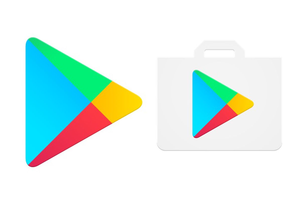
Today, Google adopted an updated Play Store icon dropping the traditional shopping bag. With this change, the new Play Store icon looks slightly different from what we are seeing since long. The new icon is only a triangle, as Google retired the veteran shopping bag.

This all new Play Store icon looks clean and simple with minimalist design. Google always wants to keep things organized and straight forward. With round icons on Pixel devices, Google already wiped out the shopping bag and now its set aside for other Android devices as well.
At this time, it seems that Google has made changes to the Play Store icon only as the entire Play Store was revamped recently. Google made significant changes to make Play store captivating and convenient for android users.
Do let us know what you think of the new Play Store icon. Did old school icon look more appealing? OR The new one looks superior?
